<ul class="accordion-container">
      <li class="accordion-item" style="background-image: url(bg1.jpg);">
        <p class="accordion-title">背景1</p>
      </li>
      ···
 </ul>
.accordion-container {
      overflow: hidden;
      display: flex;
      justify-content: flex-start;
      align-items: flex-start;
      .accordion-item {
        list-style: none;
        height: 500px;
        transition: width 0.5s;
        background-repeat: no-repeat;
        background-size: cover;
        background-position: center center;
        position: relative;
        display: flex;
        justify-content: center;
        align-items: center;
        &:not(:hover) {
          width: 20%;
        }
        &:hover {
          width: 800px;
          &::after {
            opacity: 1;
          }
        }
        &::after{
          content:'';
          width: 100%;
          height: 100%;
          position: absolute;
          left: 0;
          top: 0;
          background-color: rgba(0, 0, 0, .4);
          z-index: 1;
          opacity: 0;
          transition: opacity 0.5s;
        }
        .accordion-title {
          color: #fff;
          font-size: 18px;
          z-index: 2;
        }
      }
  }
手风琴完整代码
<style scoped lang="scss">
.accordion-container {
padding: 0;
overflow: hidden;
display: flex;
justify-content: flex-start;
align-items: flex-start;
.accordion-item {
list-style: none;
height: 500px;
transition: width 0.5s;
background-repeat: no-repeat;
background-size: 500px;
background-position: center center;
position: relative;
display: flex;
justify-content: center;
align-items: center;
&:not(:hover) {
width: 20%;
}
&:hover {
width: 500px;
&::after {
opacity: 1;
}
}
&::after {
content: "";
width: 100%;
height: 100%;
position: absolute;
left: 0;
top: 0;
background-color: rgba(0, 0, 0, 0.4);
z-index: 1;
opacity: 0;
transition: opacity 0.5s;
}
.accordion-title {
color: #fff;
font-size: 18px;
z-index: 2;
}
}
}
</style>
<template>
<div>
<ul class="accordion-container">
<li class="accordion-item"
v-for="(item,index) in items"
:key="index"
:style="{'backgroundImage':`url(${item.src})`,width:100/item.length+'%'}">
<p class="accordion-title">{{item.title}}</p>
</li>
</ul>
</div>
</template>
<script>
export default {
name: "accordion",
data() {
return {
items: [
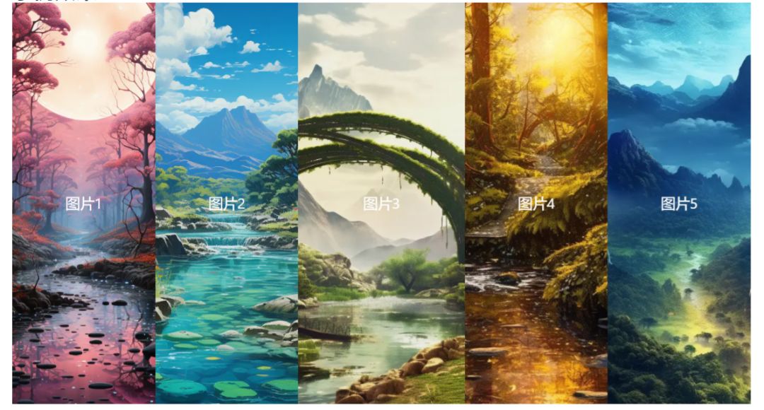
{
title: `图片1`,
src:"https://cdn.ai-art.com.cn/static/upload/midjourney/mj/static/upload/other/20230625/2587.png?imageView2/0/format/webp/q/75"
},
{
title: `图片2`,
src: "https://cdn.ai-art.com.cn/static/upload/midjourney/mj/static/upload/other/20230625/2545.png?imageView2/0/format/webp/q/75"
},
{
title: `图片3`,
src: "https://cdn.ai-art.com.cn/static/upload/midjourney/mj/static/upload/other/20230604/1004.png?imageView2/0/format/webp/q/75"
},
{
title: `图片4`,
src: "https://cdn.ai-art.com.cn/static/upload/midjourney/mj/static/upload/other/20230604/994.png?imageView2/0/format/webp/q/75"
},
{
title: `图片5`,
src: "https://cdn.ai-art.com.cn/static/upload/midjourney/mj/static/upload/other/20230527/375.png?imageView2/0/format/webp/q/75"
}
]
};
}
};
</script>