目录
- 1 主成分分析可视化结果
- 1.1 查看莺尾花数据集(前五行,前四列)
- 1.2 使用莺尾花数据集进行主成分分析后可视化展示
- 2 圆环图绘制
- 3 马赛克图绘制
- 3.1 构造数据
- 3.2 ggplot2包的geom_rect()函数绘制马赛克图
- 3.3 vcd包的mosaic()函数绘制马赛克图
- 3.4 graphics包的mosaicplot()函数绘制马赛克图
- 4 棒棒糖图绘制
- 4.1 查看内置示例数据
- 4.2 绘制基础棒棒糖图(使用ggplot2)
- 4.2.1 更改点的大小,形状,颜色和透明度
- 4.2.2 更改辅助线段的大小,颜色和类型
- 4.2.3 对点进行排序,坐标轴翻转
- 4.3 绘制棒棒糖图(使用ggpubr)
- 4.3.1 使用ggdotchart函数绘制棒棒糖图
- 4.3.2 自定义一些参数
- 5 三相元图绘制
- 5.1 构建数据
- 5.1.1 R-ggtern包绘制三相元图
- 5.1.2 优化处理
- 6 华夫饼图绘制
- 6.1 数据准备
- 6.1.1 ggplot 包绘制
- 6.1.2 点状华夫饼图ggplot绘制
- 6.1.3 堆积型华夫饼图
- 6.1.4 waffle 包绘制(一个好用的包,专为华夫饼图做准备的)
- 7 三维散点图绘制
- 7.1 简单绘制
- 7.2 加入第四个变量,进行颜色分组
- 7.2.1 方法一
- 7.2.2 方法二
- 7.3 用rgl包的plot3d()进行绘制
- 总结
1 主成分分析可视化结果
1.1 查看莺尾花数据集(前五行,前四列)
iris[:5,-5]
##   Sepal.Length Sepal.Width Petal.Length Petal.Width
##          5.1         3.5          1.4         0.2
##          4.9         3.0          1.4         0.2
##          4.7         3.2          1.3         0.2
##          4.6         3.1          1.5         0.2
##          5.0         3.6          1.4         0.2
1.2 使用莺尾花数据集进行主成分分析后可视化展示
library("ggplot")
library("ggbiplot")
## 载入需要的程辑包:plyr
## 载入需要的程辑包:scales
## 载入需要的程辑包:grid
res.pca = prcomp(iris[,-],scale=TRUE)
ggbiplot(res.pca,obs.scale=,var.scale=1,ellipse=TRUE,circle=TRUE)
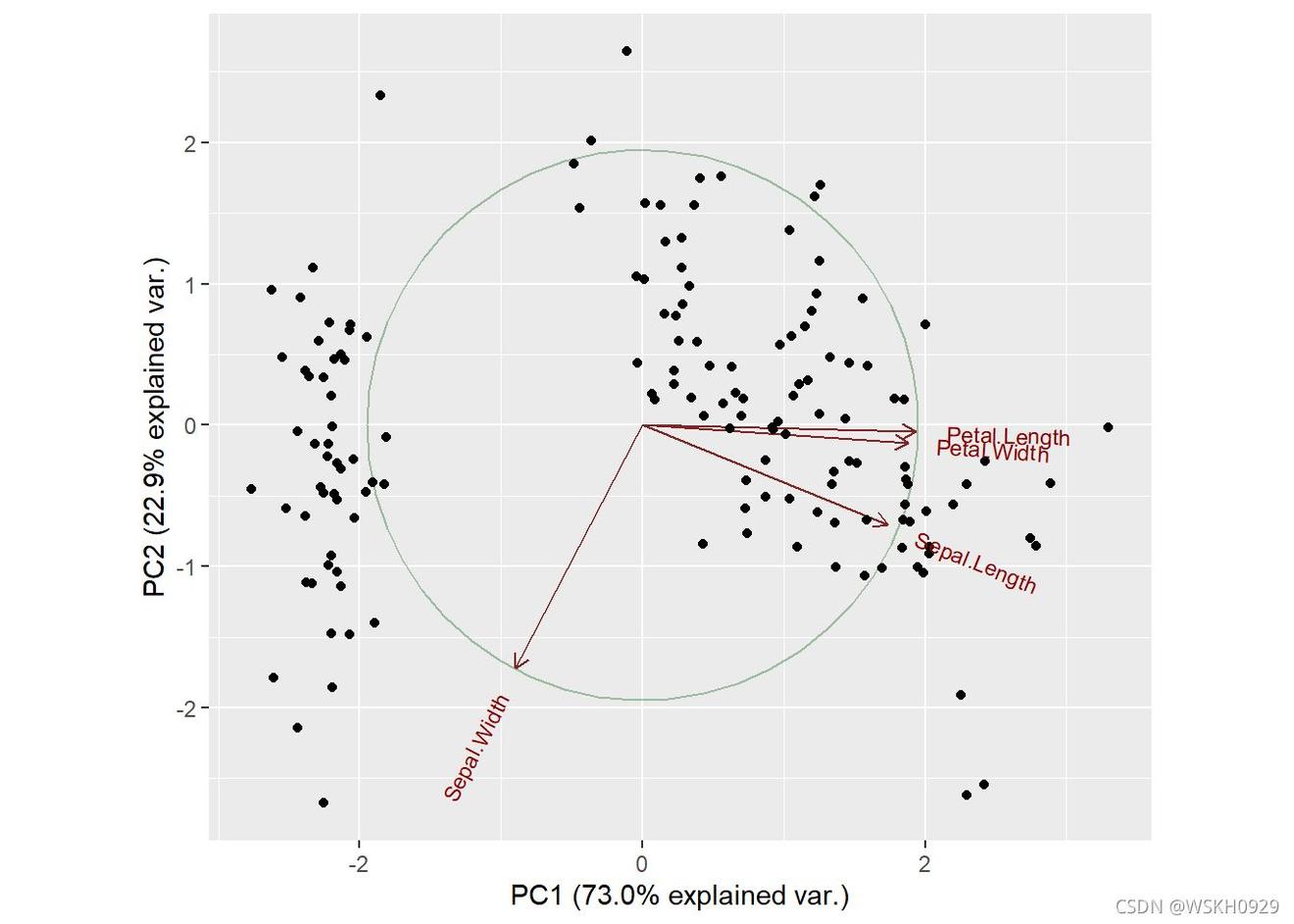
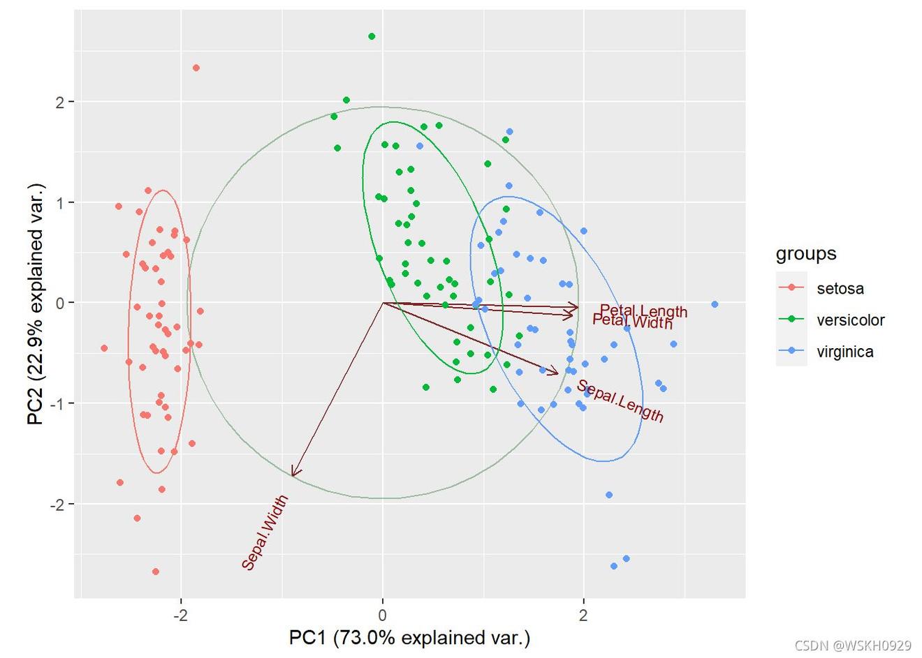
#添加组别颜色
ggbiplot(res.pca,obs.scale=,var.scale=1,ellipse=TRUE,circle=TRUE,groups=iris$Species)
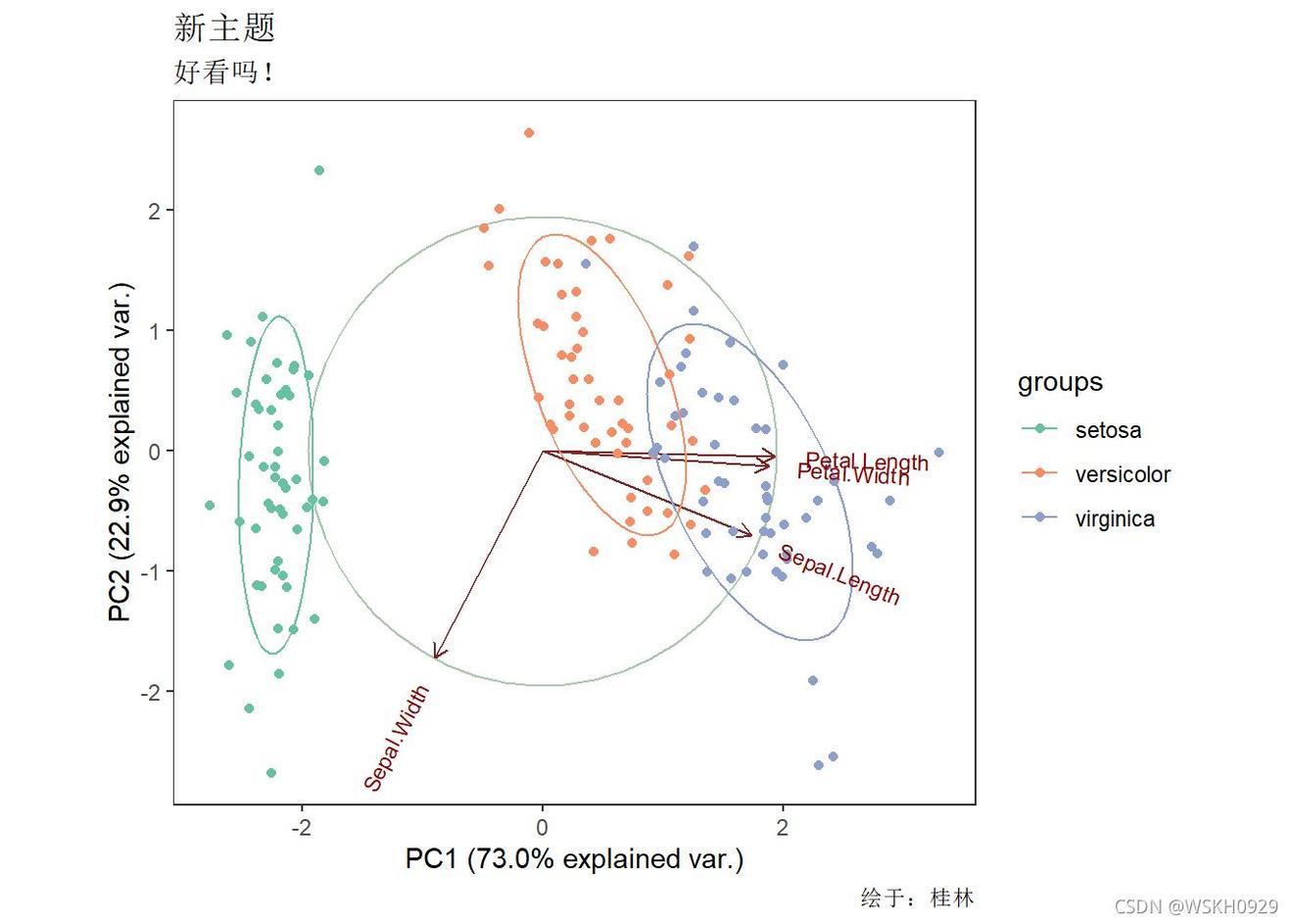
#更改绘制主题
ggbiplot(res.pca, obs.scale =, var.scale = 1, ellipse = TRUE,groups = iris$Species, circle = TRUE) +
  theme_bw() +
  theme(panel.grid = element_blank()) +
  scale_color_brewer(palette = "Set") +
  labs(title = "新主题",subtitle = "好看吗!",caption ="绘于:桂林")
2 圆环图绘制
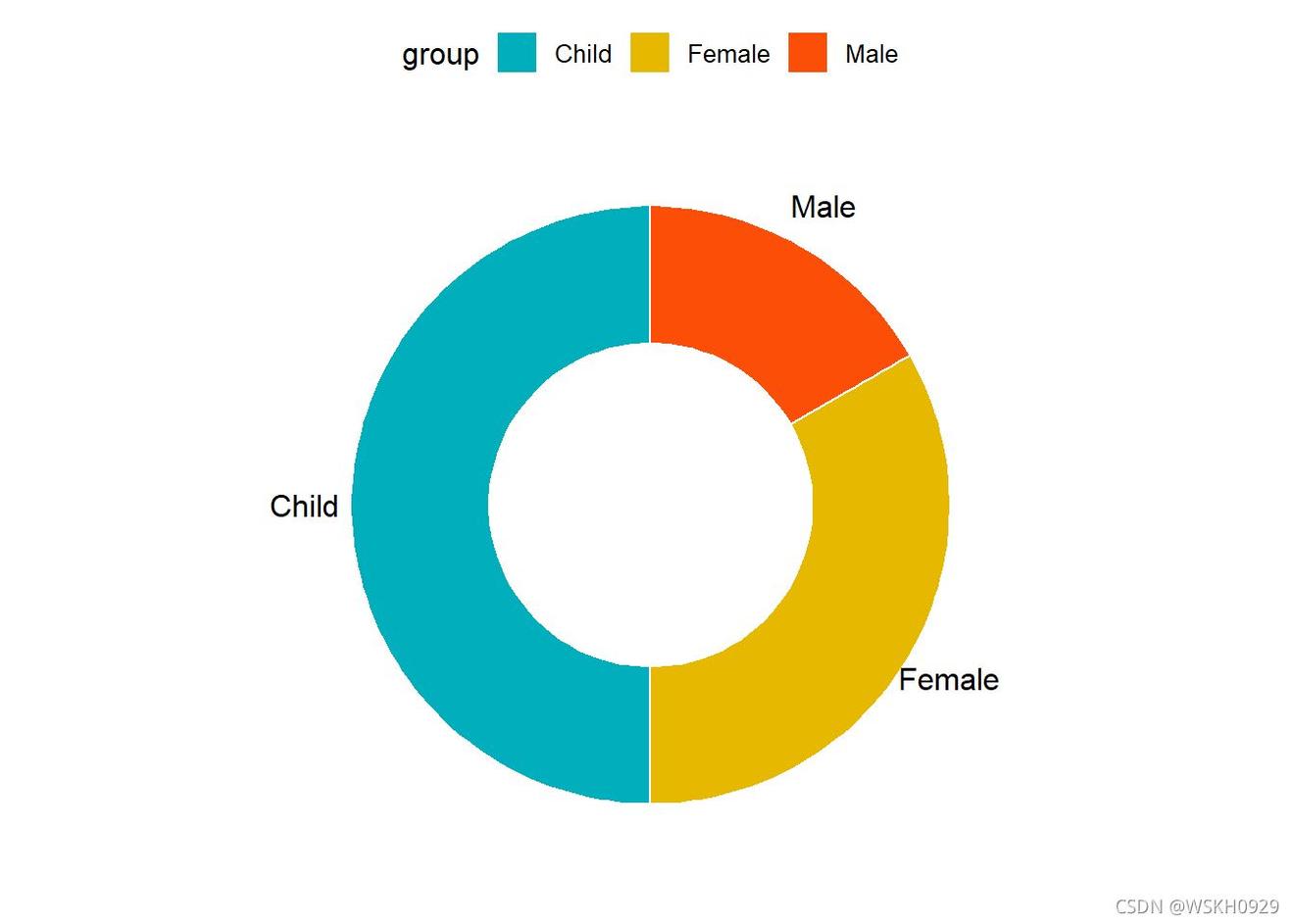
#构造数据
df <- data.frame(
  group = c("Male", "Female", "Child"),
  value = c(, 20, 30))
#ggpubr包绘制圆环图
library("ggpubr")
##
## 载入程辑包:'ggpubr'
## The following object is masked from 'package:plyr':
##
##     mutate
ggdonutchart(df, "value",
             label = "group",
             fill = "group",
             color = "white",
             palette = c("#AFBB", "#E7B800", "#FC4E07")
)
3 马赛克图绘制
3.1 构造数据
library(ggplot)
library(RColorBrewer)
library(reshape)  #提供melt()函数
library(plyr)      #提供ddply()函数,join()函数

df <- data.frame(segment = c("A", "B", "C","D"),
                      Alpha = c(    ,1200,  600 ,250),
                      Beta = c( ,900,   600,    250),
                      Gamma = c(,    600 ,400,   250),
                      Delta = c(,    300 ,400,   250))

melt_df<-melt(df,id="segment")
df
##   segment Alpha Beta Gamma Delta
##       A  2400 1000   400   200
##       B  1200  900   600   300
##       C   600  600   400   400
##       D   250  250   250   250
#计算出每行的最大,最小值,并计算每行各数的百分比。ddply()对data.frame分组计算,并利用join()函数进行两个表格连接。
segpct<-rowSums(df[,:ncol(df)])
for (i in:nrow(df)){
  for (j in:ncol(df)){
    df[i,j]<-df[i,j]/segpct[i]*  #将数字转换成百分比
  }
}

segpct<-segpct/sum(segpct)*
df$xmax <- cumsum(segpct)
df$xmin <- (df$xmax - segpct)

dfm <- melt(df, id = c("segment", "xmin", "xmax"),value.name="percentage")
colnames(dfm)[ncol(dfm)]<-"percentage"

#ddply()函数使用自定义统计函数,对data.frame分组计算
dfm <- ddply(dfm, .(segment), transform, ymax = cumsum(percentage))
dfm <- ddply(dfm1, .(segment), transform,ymin = ymax - percentage)
dfm$xtext <- with(dfm1, xmin + (xmax - xmin)/2)
dfm$ytext <- with(dfm1, ymin + (ymax - ymin)/2)

#join()函数,连接两个表格data.frame
dfm<-join(melt_df, dfm1, by = c("segment", "variable"), type = "left", match = "all")
dfm
##    segment variable value xmin xmax percentage ymax ymin xtext ytext
##        A    Alpha  2400    0   40         60   60    0    20  30.0
##        B    Alpha  1200   40   70         40   40    0    55  20.0
##        C    Alpha   600   70   90         30   30    0    80  15.0
##        D    Alpha   250   90  100         25   25    0    95  12.5
##        A     Beta  1000    0   40         25   85   60    20  72.5
##        B     Beta   900   40   70         30   70   40    55  55.0
##        C     Beta   600   70   90         30   60   30    80  45.0
##        D     Beta   250   90  100         25   50   25    95  37.5
##        A    Gamma   400    0   40         10   95   85    20  90.0
##       B    Gamma   600   40   70         20   90   70    55  80.0
##       C    Gamma   400   70   90         20   80   60    80  70.0
##       D    Gamma   250   90  100         25   75   50    95  62.5
##       A    Delta   200    0   40          5  100   95    20  97.5
##       B    Delta   300   40   70         10  100   90    55  95.0
##       C    Delta   400   70   90         20  100   80    80  90.0
##       D    Delta   250   90  100         25  100   75    95  87.5
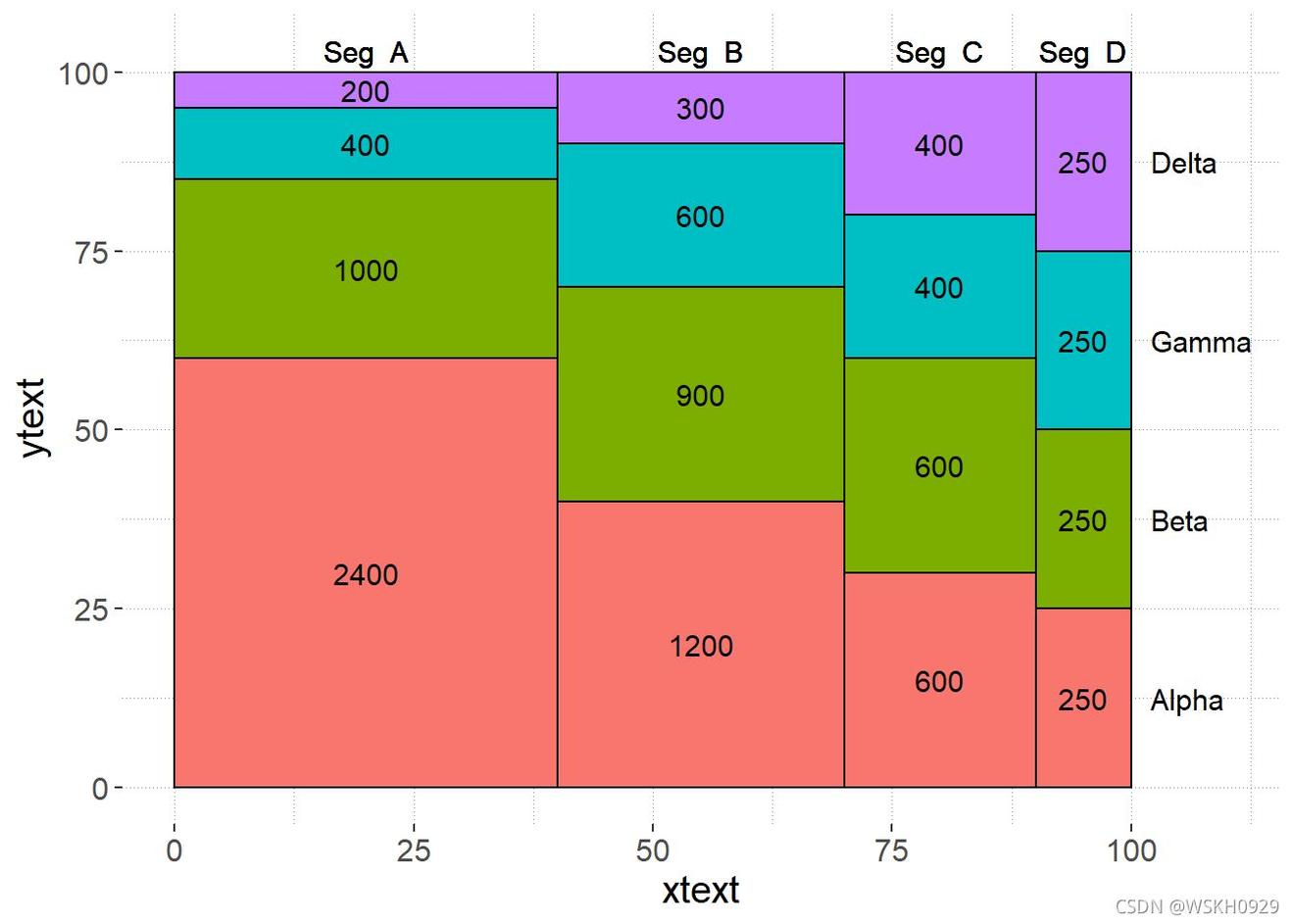
3.2 ggplot2包的geom_rect()函数绘制马赛克图
ggplot()+
  geom_rect(aes(ymin = ymin, ymax = ymax, xmin = xmin, xmax = xmax, fill = variable),dfm,colour = "black") +
  geom_text(aes(x = xtext, y = ytext,  label = value),dfm ,size = 4)+
  geom_text(aes(x = xtext, y =, label = paste("Seg ", segment)),dfm2 ,size = 4)+
  geom_text(aes(x =, y = seq(12.5,100,25), label = c("Alpha","Beta","Gamma","Delta")), size = 4,hjust = 0)+
  scale_x_continuous(breaks=seq(,100,25),limits=c(0,110))+
  theme(panel.background=element_rect(fill="white",colour=NA),
        panel.grid.major = element_line(colour = "grey",size=.25,linetype ="dotted" ),
        panel.grid.minor = element_line(colour = "grey",size=.25,linetype ="dotted" ),
        text=element_text(size=),
        legend.position="none")
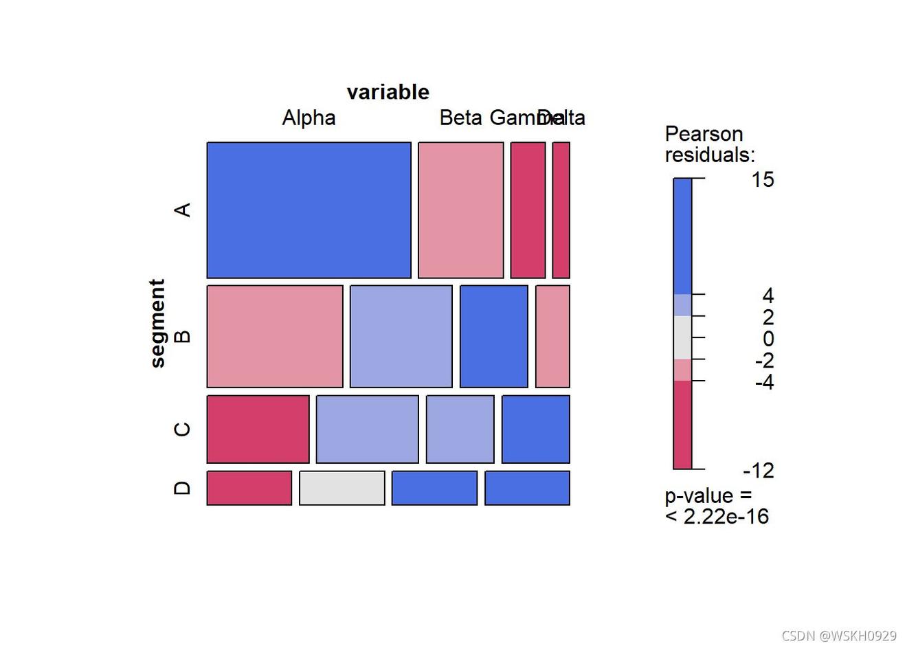
3.3 vcd包的mosaic()函数绘制马赛克图
library(vcd)
table<-xtabs(value ~variable+segment, melt_df)
mosaic( ~segment+variable,table,shade=TRUE,legend=TRUE,color=TRUE)
包的mosaic()函数绘制马赛克图
library(vcd)
table<-xtabs(value ~variable+segment, melt_df)
mosaic( ~segment+variable,table,shade=TRUE,legend=TRUE,color=TRUE)
3.4 graphics包的mosaicplot()函数绘制马赛克图
library(graphics)
library(wesanderson) #颜色提取
mosaicplot( ~segment+variable,table, color = wes_palette("GrandBudapest"),main = '')
4 棒棒糖图绘制
4.1 查看内置示例数据
library(ggplot)
data("mtcars")
df <- mtcars
# 转换为因子
df$cyl <- as.factor(df$cyl)
df$name <- rownames(df)
head(df)
##                    mpg cyl disp  hp drat    wt  qsec vs am gear carb
## Mazda RX         21.0   6  160 110 3.90 2.620 16.46  0  1    4    4
## Mazda RX Wag     21.0   6  160 110 3.90 2.875 17.02  0  1    4    4
## Datsun        22.8   4  108  93 3.85 2.320 18.61  1  1    4    1
## Hornet Drive    21.4   6  258 110 3.08 3.215 19.44  1  0    3    1
## Hornet Sportabout.7   8  360 175 3.15 3.440 17.02  0  0    3    2
## Valiant.1   6  225 105 2.76 3.460 20.22  1  0    3    1
##                                name
## Mazda RX                 Mazda RX4
## Mazda RX Wag         Mazda RX4 Wag
## Datsun               Datsun 710
## Hornet Drive       Hornet 4 Drive
## Hornet Sportabout Hornet Sportabout
## Valiant                     Valiant
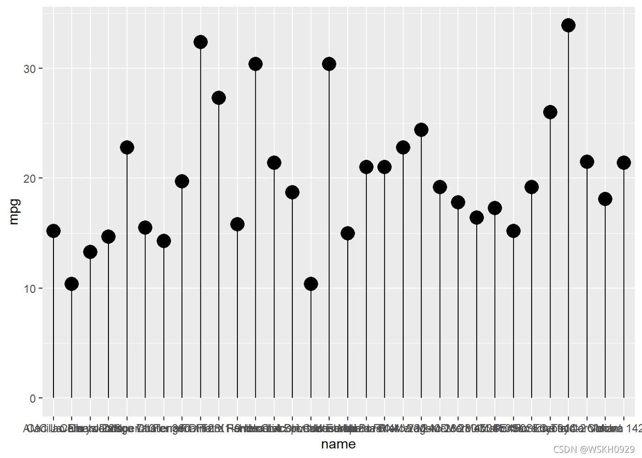
4.2 绘制基础棒棒糖图(使用ggplot2)
ggplot(df,aes(name,mpg)) +
  # 添加散点
  geom_point(size=) +
  # 添加辅助线段
  geom_segment(aes(x=name,xend=name,y=,yend=mpg))
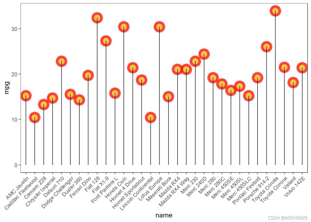
4.2.1 更改点的大小,形状,颜色和透明度
ggplot(df,aes(name,mpg)) +
  # 添加散点
  geom_point(size=, color="red", fill=alpha("orange", 0.3),
             alpha=.7, shape=21, stroke=3) +
  # 添加辅助线段
  geom_segment(aes(x=name,xend=name,y=,yend=mpg)) +
  theme_bw() +
  theme(axis.text.x = element_text(angle =,hjust = 1),
        panel.grid = element_blank())
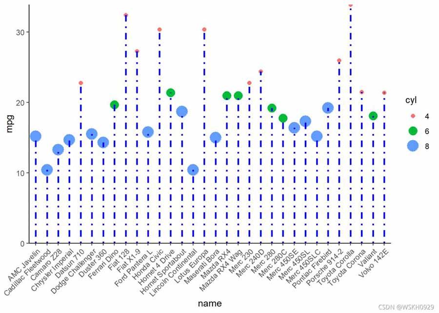
4.2.2 更改辅助线段的大小,颜色和类型
ggplot(df,aes(name,mpg)) +
  # 添加散点
  geom_point(aes(size=cyl,color=cyl)) +
  # 添加辅助线段
  geom_segment(aes(x=name,xend=name,y=,yend=mpg),
               size=, color="blue", linetype="dotdash") +
  theme_classic() +
  theme(axis.text.x = element_text(angle =,hjust = 1),
        panel.grid = element_blank()) +
  scale_y_continuous(expand = c(,0))
## Warning: Using size for a discrete variable is not advised.
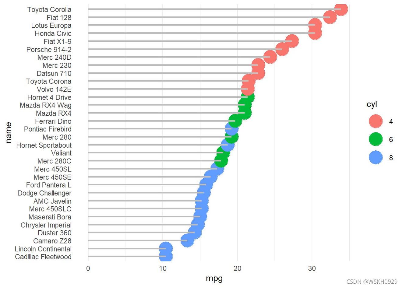
4.2.3 对点进行排序,坐标轴翻转
df <- df[order(df$mpg),]
# 设置因子进行排序
df$name <- factor(df$name,levels = df$name)

ggplot(df,aes(name,mpg)) +
  # 添加散点
  geom_point(aes(color=cyl),size=) +
  # 添加辅助线段
  geom_segment(aes(x=name,xend=name,y=,yend=mpg),
               size=, color="gray") +
  theme_minimal() +
  theme(
    panel.grid.major.y = element_blank(),
    panel.border = element_blank(),
    axis.ticks.y = element_blank()
  ) +
  coord_flip()
4.3 绘制棒棒糖图(使用ggpubr)
library(ggpubr)
# 查看示例数据
head(df)
##                      mpg cyl disp  hp drat    wt  qsec vs am gear carb
## Cadillac Fleetwood.4   8  472 205 2.93 5.250 17.98  0  0    3    4
## Lincoln Continental.4   8  460 215 3.00 5.424 17.82  0  0    3    4
## Camaro Z          13.3   8  350 245 3.73 3.840 15.41  0  0    3    4
## Duster          14.3   8  360 245 3.21 3.570 15.84  0  0    3    4
## Chrysler Imperial.7   8  440 230 3.23 5.345 17.42  0  0    3    4
## Maserati Bora.0   8  301 335 3.54 3.570 14.60  0  1    5    8
##                                    name
## Cadillac Fleetwood   Cadillac Fleetwood
## Lincoln Continental Lincoln Continental
## Camaro Z                   Camaro Z28
## Duster                   Duster 360
## Chrysler Imperial     Chrysler Imperial
## Maserati Bora             Maserati Bora
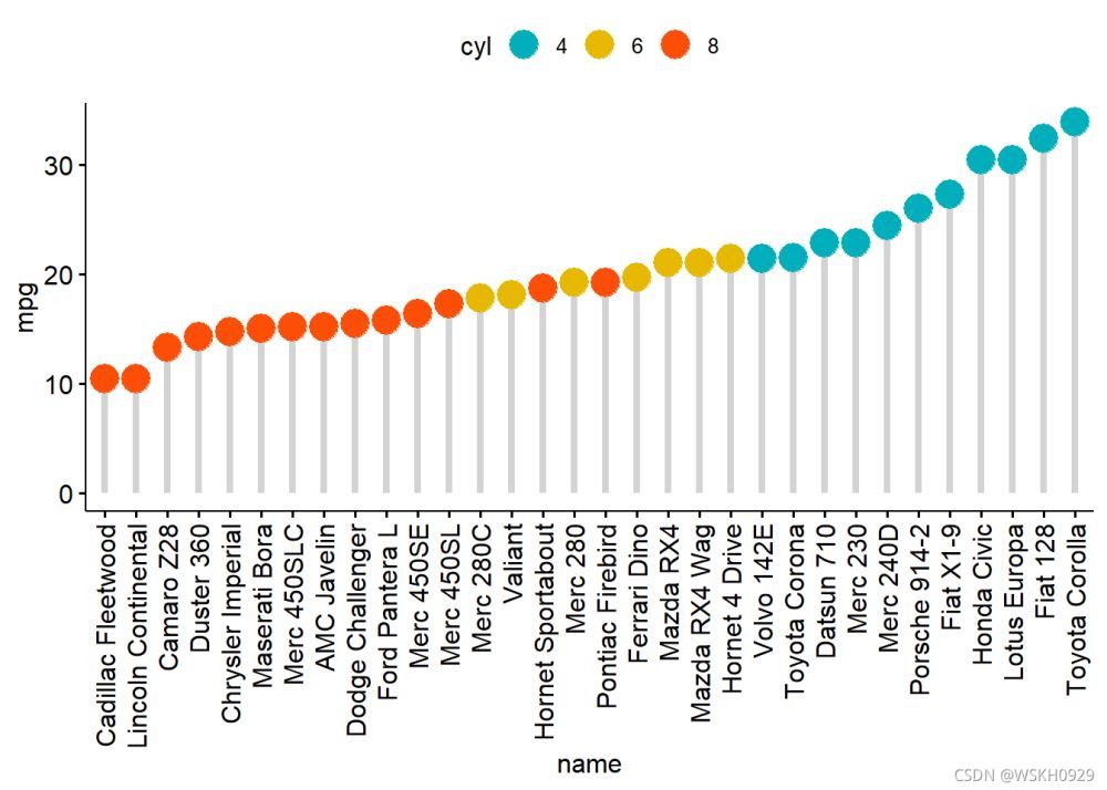
4.3.1 使用ggdotchart函数绘制棒棒糖图
ggdotchart(df, x = "name", y = "mpg",
           color = "cyl", # 设置按照cyl填充颜色
           size =, # 设置点的大小
           palette = c("#AFBB", "#E7B800", "#FC4E07"), # 修改颜色画板
           sorting = "ascending", # 设置升序排序
           add = "segments", # 添加辅助线段
           add.params = list(color = "lightgray", size =.5), # 设置辅助线段的大小和颜色
           ggtheme = theme_pubr(), # 设置主题
)
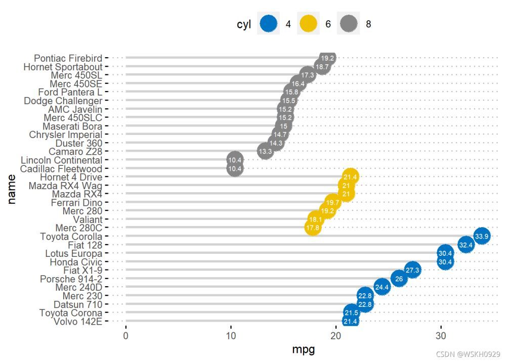
4.3.2 自定义一些参数
ggdotchart(df, x = "name", y = "mpg",
           color = "cyl", # 设置按照cyl填充颜色
           size =, # 设置点的大小
           palette = "jco", # 修改颜色画板
           sorting = "descending", # 设置降序排序
           add = "segments", # 添加辅助线段
           add.params = list(color = "lightgray", size =.2), # 设置辅助线段的大小和颜色
           rotate = TRUE, # 旋转坐标轴方向
           group = "cyl", # 设置按照cyl进行分组
           label = "mpg", # 按mpg添加label标签
           font.label = list(color = "white",
                             size =,
                             vjust =.5), # 设置label标签的字体颜色和大小
           ggtheme = theme_pubclean(), # 设置主题
)
5 三相元图绘制
5.1 构建数据
test_data = data.frame(x = runif(),
                       y = runif(),
                       z = runif())
head(test_data)
##            x         y          z
## 0.79555379 0.1121278 0.90667083
## 0.12816648 0.8980756 0.51703604
## 0.66631357 0.5757205 0.50830765
## 0.87326608 0.2336119 0.05895517
## 0.01087468 0.7611424 0.37542833
## 0.77126494 0.2682030 0.49992176
5.1.1 R-ggtern包绘制三相元图
library(tidyverse)
## -- Attaching packages --------------------------------------- tidyverse.3.1 --
## v tibble.1.3 v dplyr 1.0.7
## v tidyr.1.3 v stringr 1.4.0
## v readr.0.1 v forcats 0.5.1
## v purrr.3.4
## -- Conflicts ------------------------------------------ tidyverse_conflicts() --
## x dplyr::arrange() masks plyr::arrange()
## x readr::col_factor() masks scales::col_factor()
## x purrr::compact() masks plyr::compact()
## x dplyr::count() masks plyr::count()
## x purrr::discard() masks scales::discard()
## x dplyr::failwith() masks plyr::failwith()
## x dplyr::filter() masks stats::filter()
## x dplyr::id() masks plyr::id()
## x dplyr::lag() masks stats::lag()
## x dplyr::mutate() masks ggpubr::mutate(), plyr::mutate()
## x dplyr::rename() masks plyr::rename()
## x dplyr::summarise() masks plyr::summarise()
## x dplyr::summarize() masks plyr::summarize()
library(ggtern)
## Registered S methods overwritten by 'ggtern':
## method from
## grid.draw.ggplot ggplot
## plot.ggplot ggplot
## print.ggplot ggplot
## --
## Remember to cite, run citation(package = 'ggtern') for further info.
## --
##
## 载入程辑包:'ggtern'
## The following objects are masked from 'package:ggplot':
##
## aes, annotate, ggplot, ggplot_build, ggplot_gtable, ggplotGrob,
## ggsave, layer_data, theme_bw, theme_classic, theme_dark,
## theme_gray, theme_light, theme_linedraw, theme_minimal, theme_void
library(hrbrthemes)
## NOTE: Either Arial Narrow or Roboto Condensed fonts are required to use these themes.
## Please use hrbrthemes::import_roboto_condensed() to install Roboto Condensed and
## if Arial Narrow is not on your system, please see https://bit.ly/arialnarrow
library(ggtext)
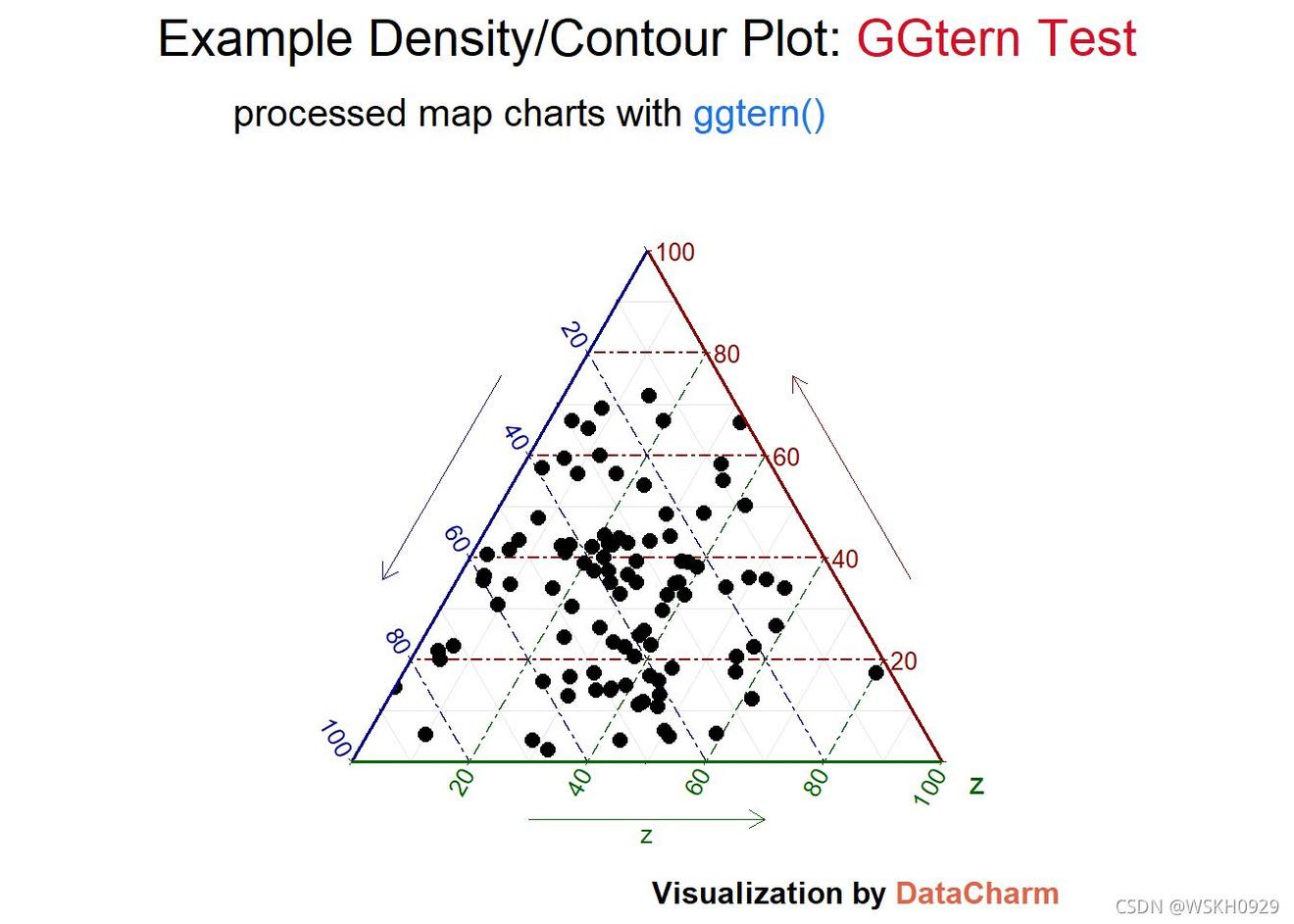
test_plot_pir <- ggtern(data = test_data,aes(x, y, z))+
geom_point(size=.5)+
theme_rgbw(base_family = "") +
labs(x="",y="",
title = "Example Density/Contour Plot: <span style='color:#DF26'>GGtern Test</span>",
subtitle = "processed map charts with <span style='color:#A73E8'>ggtern()</span>",
caption = "Visualization by <span style='color:#DD'>DataCharm</span>") +
guides(color = "none", fill = "none", alpha = "none")+
theme(
plot.title = element_markdown(hjust =.5,vjust = .5,color = "black",
size =, margin = margin(t = 1, b = 12)),
plot.subtitle = element_markdown(hjust =,vjust = .5,size=15),
plot.caption = element_markdown(face = 'bold',size =),
)
test_plot_pir

5.1.2 优化处理
test_plot <- ggtern(data = test_data,aes(x, y, z),size=)+
    stat_density_tern(geom = 'polygon',n =,
                      aes(fill  = ..level..,
                          alpha = ..level..))+
    geom_point(size=.5)+
    theme_rgbw(base_family = "") +
    labs(x="",y="",
        title = "Example Density/Contour Plot: <span style='color:#DF26'>GGtern Test</span>",
        subtitle = "processed map charts with <span style='color:#A73E8'>ggtern()</span>",
        caption = "Visualization by <span style='color:#DD'>DataCharm</span>") +
    scale_fill_gradient(low = "blue",high = "red")  +
    #去除映射属性的图例
    guides(color = "none", fill = "none", alpha = "none")+
    theme(
        plot.title = element_markdown(hjust =.5,vjust = .5,color = "black",
                             size =, margin = margin(t = 1, b = 12)),
        plot.subtitle = element_markdown(hjust =,vjust = .5,size=15),
        plot.caption = element_markdown(face = 'bold',size =),
        )
test_plot
## Warning: stat_density_tern: You have not specified a below-detection-limit (bdl) value (Ref. 'bdl' and 'bdl.val' arguments in ?stat_density_tern). Presently you havex value/s below a detection limit of 0.010, which acounts for 2.000% of your data. Density values at fringes may appear abnormally high attributed to the mathematics of the ILR transformation.
## You can either:
##. Ignore this warning,
##. Set the bdl value appropriately so that fringe values are omitted from the ILR calculation, or
##. Accept the high density values if they exist, and manually set the 'breaks' argument
##    so that the countours at lower densities are represented appropriately.
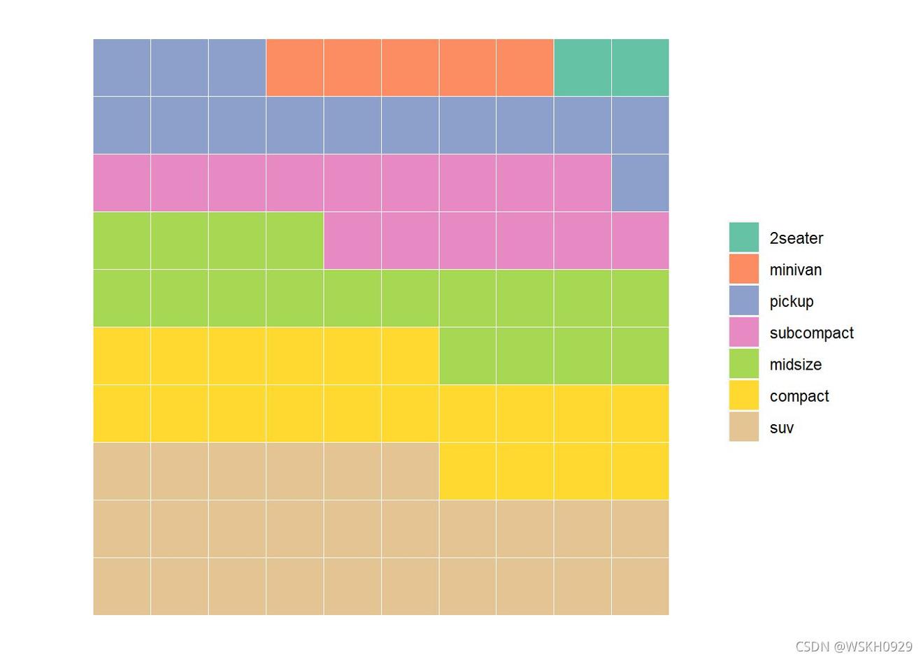
6 华夫饼图绘制
6.1 数据准备
#相关包
library(ggplot)
library(RColorBrewer)
library(reshape)
#数据生成
nrows <-
categ_table <- round(table(mpg$class ) * ((nrows*nrows)/(length(mpg$class))))
sort_table<-sort(categ_table,index.return=TRUE,decreasing = FALSE)
Order<-sort(as.data.frame(categ_table)$Freq,index.return=TRUE,decreasing = FALSE)
df <- expand.grid(y =:nrows, x = 1:nrows)
df$category<-factor(rep(names(sort_table),sort_table), levels=names(sort_table))
Color<-brewer.pal(length(sort_table), "Set")
head(df)
##   y x category
## 1 1  2seater
## 2 1  2seater
## 3 1  minivan
## 4 1  minivan
## 5 1  minivan
## 6 1  minivan
6.1.1 ggplot 包绘制
ggplot(df, aes(x = y, y = x, fill = category)) +
geom_tile(color = "white", size =.25) +
#geom_point(color = "black",shape=,size=5) +
coord_fixed(ratio =)+ #x,y 轴尺寸固定, ratio=1 表示 x , y 轴长度相同
scale_x_continuous(trans = 'reverse') +#expand = c(, 0),
scale_y_continuous(trans = 'reverse') +#expand = c(, 0),
scale_fill_manual(name = "Category",
#labels = names(sort_table),
values = Color)+
theme(#panel.border = element_rect(fill=NA,size =),
panel.background = element_blank(),
plot.title = element_text(size = rel(.2)),
axis.text = element_blank(),
axis.title = element_blank(),
axis.ticks = element_blank(),
legend.title = element_blank(),
legend.position = "right")
## Coordinate system already present. Adding new coordinate system, which will replace the existing one.
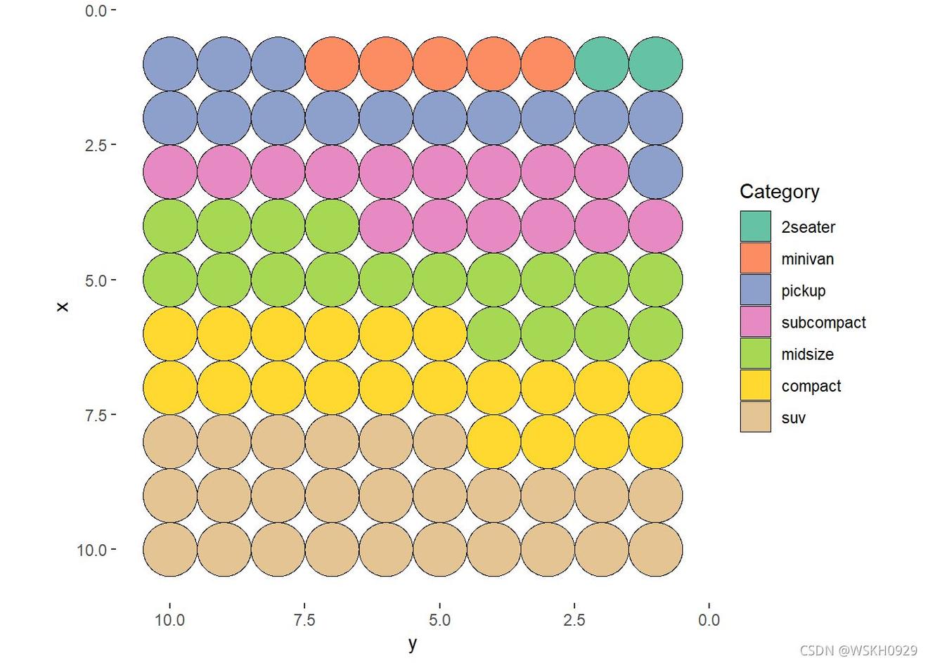
6.1.2 点状华夫饼图ggplot绘制
library(ggforce)
ggplot(df, aes(x = y, y0 = x, fill = category,r=0.5)) +
  geom_circle(color = "black", size =.25) +
  #geom_point(color = "black",shape=,size=6) +
  coord_fixed(ratio =)+
  scale_x_continuous(trans = 'reverse') +#expand = c(, 0),
  scale_y_continuous(trans = 'reverse') +#expand = c(, 0),
  scale_fill_manual(name = "Category",
                    #labels = names(sort_table),
                    values = Color)+
  theme(#panel.border = element_rect(fill=NA,size =),
    panel.background  = element_blank(),
    plot.title = element_text(size = rel(.2)),
    legend.position = "right")
## Coordinate system already present. Adding new coordinate system, which will replace the existing one.
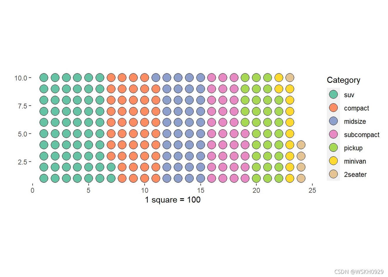
6.1.3 堆积型华夫饼图
library(dplyr)
nrows <-
ndeep <-
unit<-
df <- expand.grid(y =:nrows, x = 1:nrows)

categ_table <- as.data.frame(table(mpg$class) * (nrows*nrows))
colnames(categ_table)<-c("names","vals")
categ_table<-arrange(categ_table,desc(vals))
categ_table$vals<-categ_table$vals /unit

tbwaffles <- expand.grid(y = 1:ndeep,x = seq_len(ceiling(sum(categ_table$vals) / ndeep)))
regionvec <- as.character(rep(categ_table$names, categ_table$vals))
tbwaffles<-tb4waffles[1:length(regionvec),]

tbwaffles$names <- factor(regionvec,levels=categ_table$names)

Color<-brewer.pal(nrow(categ_table), "Set")
ggplot(tbwaffles, aes(x = x, y = y, fill = names)) +
  #geom_tile(color = "white") + #
  geom_point(color = "black",shape=,size=5) + #
  scale_fill_manual(name = "Category",
                    values = Color)+
  xlab(" square = 100")+
  ylab("")+
  coord_fixed(ratio =)+
  theme(#panel.border = element_rect(fill=NA,size =),
         panel.background  = element_blank(),
        plot.title = element_text(size = rel(.2)),
        #axis.text = element_blank(),
        #axis.title = element_blank(),
        #axis.ticks = element_blank(),
        # legend.title = element_blank(),
        legend.position = "right")
## Coordinate system already present. Adding new coordinate system, which will replace the existing one.
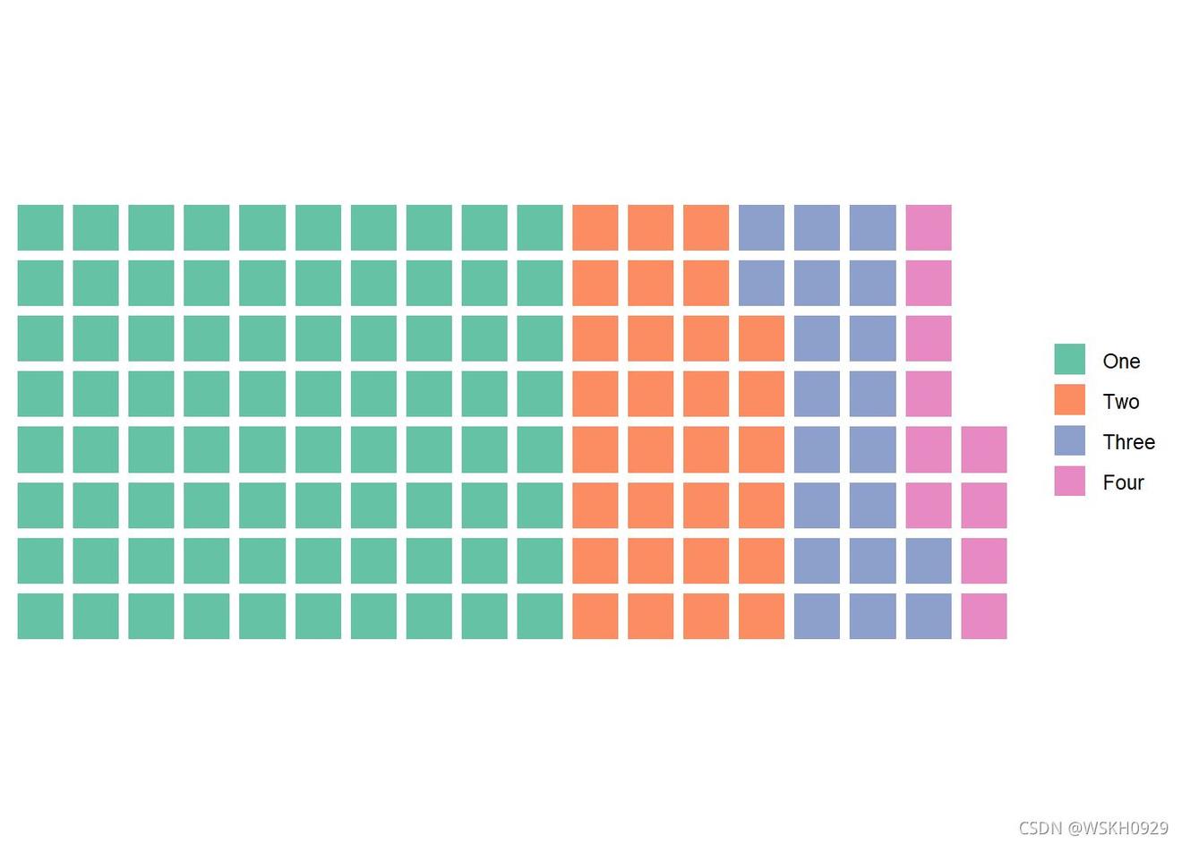
6.1.4 waffle 包绘制(一个好用的包,专为华夫饼图做准备的)
#waffle(parts, rows =, keep = TRUE, xlab = NULL, title = NULL, colors = NA, size = 2, flip = FALSE, reverse = FALSE, equal = TRUE, pad = 0, use_glyph = FALSE, glyph_size = 12, legend_pos = "right")
#parts 用于图表的值的命名向量
#rows 块的行数
#keep 保持因子水平(例如,在华夫饼图中获得一致的图例)
library("waffle")
parts <- c(One=, Two=30, Three=20, Four=10)
chart <- waffle(parts, rows=)
print(chart)
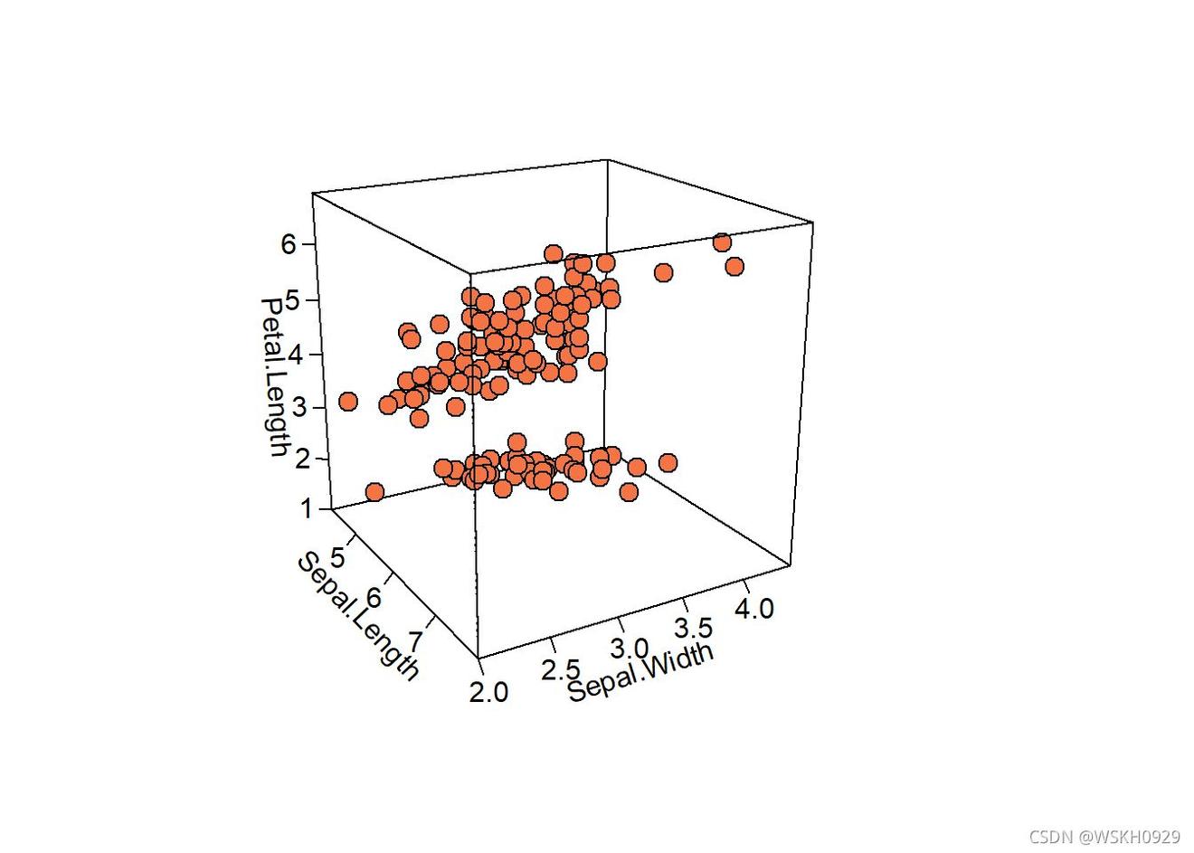
7 三维散点图绘制
7.1 简单绘制
library("plotD")
#以Sepal.Length为x轴,Sepal.Width为y轴,Petal.Length为z轴。绘制箱子型box = TRUE;旋转角度为theta =, phi = 20;透视转换强度的值为3d=3;按照2D图绘制正常刻度ticktype = "detailed";散点图的颜色设置bg="#F57446"
pmar <- par(mar = c(.1, 4.1, 4.1, 6.1)) #改版画布版式大小
with(iris, scatterD(x = Sepal.Length, y = Sepal.Width, z = Petal.Length,
  pch =, cex = 1.5,col="black",bg="#F57446",
                   xlab = "Sepal.Length",
                   ylab = "Sepal.Width",
                   zlab = "Petal.Length",
                   ticktype = "detailed",bty = "f",box = TRUE,
                   theta =, phi = 20, d=3,
                   colkey = FALSE)
)
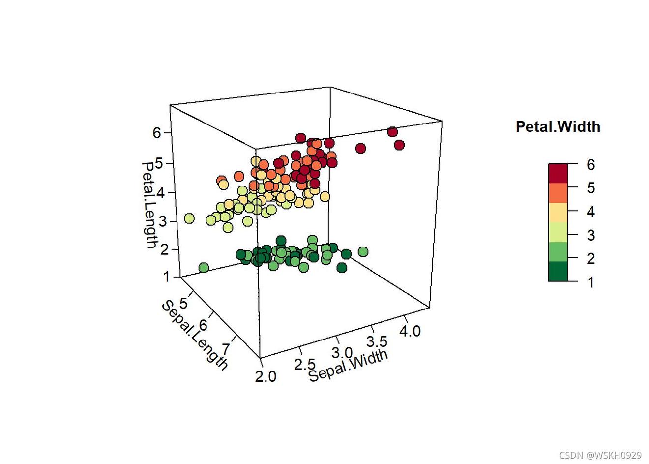
7.2 加入第四个变量,进行颜色分组
7.2.1 方法一
#可以将变量Petal.Width映射到数据点颜色中。该变量是连续性,如果想将数据按从小到大分成n类,则可以使用dplyr包中的ntile()函数,然后依次设置不同组的颜色bg=colormap[iris$quan],并根据映射的数值添加图例颜色条(colkey())。
library(tidyverse)
iris = iris %>% mutate(quan = ntile(Petal.Width,))
colormap <- colorRampPalette(rev(brewer.pal(,'RdYlGn')))(6)#legend颜色配置
pmar <- par(mar = c(.1, 4.1, 4.1, 6.1))
# 绘图
with(iris, scatterD(x = Sepal.Length, y = Sepal.Width, z = Petal.Length,pch = 21, cex = 1.5,col="black",bg=colormap[iris$quan],
     xlab = "Sepal.Length",
     ylab = "Sepal.Width",
     zlab = "Petal.Length",
     ticktype = "detailed",bty = "f",box = TRUE,
     theta =, phi = 20, d=3,
     colkey = FALSE)
)
colkey (col=colormap,clim=range(iris$quan),clab = "Petal.Width", add=TRUE, length=.4,side = 4)
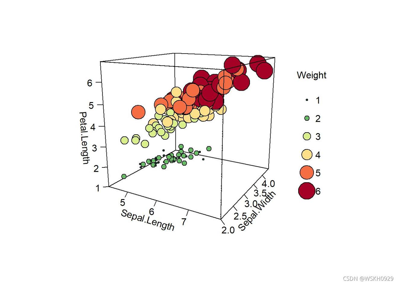
7.2.2 方法二
#将第四维数据映射到数据点的大小上(cex = rescale(iris$quan, c(., 4)))这里我还“得寸进尺”的将颜色也来反应第四维变量,当然也可以用颜色反应第五维变量。
pmar <- par(mar = c(.1, 4.1, 4.1, 6.1))
with(iris, scatterD(x = Sepal.Length, y = Sepal.Width, z = Petal.Length,pch = 21,
                     cex = rescale(iris$quan, c(., 4)),col="black",bg=colormap[iris$quan],
                     xlab = "Sepal.Length",
                     ylab = "Sepal.Width",
                     zlab = "Petal.Length",
                     ticktype = "detailed",bty = "f",box = TRUE,
                     theta =, phi = 15, d=2,
                     colkey = FALSE)
)
breaks =:6
legend("right",title =  "Weight",legend=breaks,pch=,
       pt.cex=rescale(breaks, c(., 4)),y.intersp=1.6,
       pt.bg = colormap[:6],bg="white",bty="n")
7.3 用rgl包的plot3d()进行绘制
library(rgl)
#数据
mycolors <- c('royalblue', 'darkcyan', 'oldlace')
iris$color <- mycolors[ as.numeric(iris$Species) ]
#绘制
plotd(
  x=iris$`Sepal.Length`, y=iris$`Sepal.Width`, z=iris$`Petal.Length`,
  col = iris$color,
  type = 's',
  radius = .,
  xlab="Sepal Length", ylab="Sepal Width", zlab="Petal Length")